| Dear Friends, |
Greetings. Its great to touch base with you once again this festive season. We have had quite an interesting line-up of activities in the past months. |
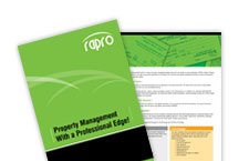
| RAPRO Makes a Splash! |
RAPRO, a property management company wanted to establish their brand presence in the market focusing on the benefits of convenience and ease they bring to customers. Their service portfolio includes buying, selling and renting property, property management and NRI consultancy. A multi-media campaign was developed including press, electronic media, outdoor media and an exhibition kiosk. |
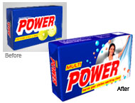
| Nature Power Bath Soap Gets Aggressive |
 |
Nature Power Bath Soap has established a strong presence in Tamilnadu and is a growing phenomenon in other states. It has launched an aggressive campaign in Karnataka and Andhra Pradesh using the electronic media & in-store promotions. |
| Indo-Western Logo For I-Strides |
 |
I-Strides is an IT company that wanted to reflect their Indian origin and international quality. The `I` is the name was set inside a red dot that represents the Indian flavour. The font used was contemporary to reflect its modern attitude. |
Emotional Surplus Identity (ESI) in Communication Strategy
Todays markets are complex and difficult to predict. However, applying the Emotional Surplus Identity (ESI) concept has proved immensely successful and multiplied customer response even in conventionally slow markets.
A communication campaign based on the Emotional Surplus strategy offers the following benefits. It brings deeper consumer insight and consumer sensitivity. For manufacturing and service companies, both B2B and B2C, this plays a critical role in converging internal operations and layers, products and brands to this sensitivity. When it comes to retail organisations ESI increases shopper footfall, conversion, retention and market share.
An example of ESI usage would be Enkorr Energy, a merchant refinery in India had the communication objective of creating a green image for themselves that would create a positive outlook for them from investors world wide. The ad headline speaks about the `Greening world for a healthy tomorrow.` Here the Rational would be the positive effect and atmosphere it creates which is a hidden deliverable that exists in the minds of consumers. The Functional would be a green world which is a benefit. The Emotional here is the coming together of both these as a concept that shows beautiful appealing green footprints in a field. This evokes a happy response in the consumer. Ultimately, the combination works well wherever it is applied. |

Our 360 degree branding initiative includes undertaking market research developing this innovative concept, technology, marketing, branding and campaigns. The portal uses state-of-art technology and is comprehensive. It allows members to Search and View profiles besides Add and Edit them. It also offers a gamut of articles on the community, rituals and items needed for organizing a Nagarathar marriage, something no other portal offers. |

| Designer Papaya Soap |
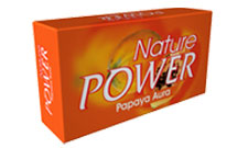
For the first time in India, Nature Power has introduced Papaya Aura, a soap shaped exactly like a half-cut papaya. The soap offers more than a fascinating shape, its enriched with the goodness of papaya known for its skin enhancing and softening properties. N&D created the packaging for this unique soap, a trendy metallic box that provides the perfect foil for this soap.
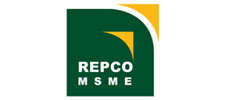
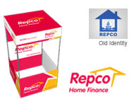
Contemporary Symbolism for REPCO MSME Logo
REPCO moves from the conventional banking to the next level by financing the Micro Small and Medium Enterprises Sector (MSME) . The logo here uses a green square to depict the banking sector. The orange arrows that shoot out of the green square depict the new MSME segment which is moving out of the boundaries of conventional banking to the next level. A contemporary symbolism of the brand’s ascent.
|