|
| Greetings ! |
Greetings. Wishing you a prosperous New Year 2007 that takes you to greater heights and achievements. We have uncorked many new initiatives and are excited to share the news with you. New portals, new branding and new campaigns have made this period a very happening one. Read on for more.
Cheers,
M Nachiappan
|
| Winner Makes A Splash |
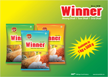
Winner, a brand new range of dhals has entered the South Indian market. The challenge was to create a distinct packaging that would stand out on the racks and also embody the features of the products like freshness and quality. Bright fresh colours like vivid blue, leaf green and flame orange and yellow were used in the packaging for the dhal variants. The design is clean and appealing. |
| Partnering With IBM |
 |
We are proud to have been appointed the Rural Strategy Partner and the Communication Agency for IBMs rural initiatives. This is a specialized portfolio and our expertise in the rural terrain will be leveraged to achieve IBMs goals. This will include everything from the basic surveys, research, communication campaigns, marketing strategies, product launches, events to post-campaign analysis. |
|
|
 |
|
Taking a local brand to a bigger market poses a big challenge. When a local brand goes national, the entire packaging, brand positioning and strategy has to be redefined. After the basic research, the regional market traits have to be abandoned in favour of traits with a larger national appeal.
|
|
 |
The packaging needs to break free of regional symbols and thoughts. The brand positioning must be based on key sale motivators in a national market. Eg: the durability of a tyre brand might be the motivation in a local market whereas its good looks would work better in a national market. The marketing strategy must be worked around this.
|
|
Triple Power Sports Fresh Look
|
|
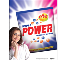 |
The packaging of Triple Power detergent sports a fresh look with bright vibrant colours like blue, red and deep pink. The Enriched Fabric Energizers (EFE) was highlighted by an icon that made sure that the consumer focused on this benefit. A move that has helped in boosting sales of the product by giving value addition at the same price tag.
|
|
|
|
| Energy Propels Enkorrs Branding and Web Portal |
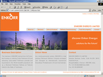 |
Enkorr is a company that provides energy solutions and plans to open a huge Merchant Refinery at Tuticorin. Their portal needed to reflect the dynamism, energy and world class approach it stood for. This was conveyed using a vibrant orange to symbolize energy on a soft white backdrop. The navigation and architecture is user-friendly and comprehensive helps the TG to track the progress. |
| New Portal Unveiled For Lenovo |
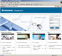 |
Lenovos Facility Management Division needed a portal that interface between them and their customers. An interactive portal that would allow internal clients to book facilities, check their availability besides post complaints and queries. It also allows the business partner and end user to post and track the issues related to DOA claims by business partners and C-sat by end users. We designed a clean, world class portal that was user-friendly and facilitated the process. The robust architecture and classy design has been appreciated.
|
 |
|