|
| Greetings ! |
It’s good to be back and theres plenty to share. You’ll find a flurry of exciting happening and launches. But what’s special this time is that we also turned our own client and revamped our site! Now you’ll find the site with 5 easy-to-browse focus areas Branding, Technology, Rural, Market Research and Events. We also added a new bit of zing to our CD Rom. Read on for more…
Will meet you with our next buzz, next year! Until then take care and wishing you a Very Happy New Year!
Warm Wishes,
M Nachiappan
Creative and Managing Director |
|
| MAAGRITA MOMENTS AT FOOD PRO 2005 |

Maagrita’s stall at the Food Pro 2005 won plenty of admiring glances. The sleek, clean international design it sported gave the neighboring Australian and Canadian stalls a run for their money. The freshness and natural exotica of Maagrita’s farm fresh produce like fruits, vegetables and spices were recreated on a lush green backdrop. The brand identity was reflected throughout the stall with an exhibition kit and scrollers complemented by wall panels and streamers. Attractive leaflets were distributed to visitors and these were enthusiastically received.  |
|
| Power Gets A Glamorous New Package |
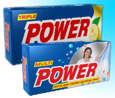 |
The packaging for Triple Power Detergent and Multi Power were given a hot new look with an attractive three layer hot melt pack with the value added advantage of retaining the fragrance and properties of the detergent. Triple Power got a touch of gold while Multipower was given a touch of silver on the pack.
|
|
|
 |
Rural Brands: Winning the Rural Game |
|
 |
Branding can be defined as “a name and /or symbol that is directly used to sell products or services’. Rural branding needs a different approach from the regular one as the entire brand development process has some factors peculiar to the rural market. For instance, it’s critical that
|
|
 |
the rural market is able to easily pronounce and remember the brand name. Before ‘Tyko’ detergent was named, there were apprehensions on whether the name would work. However, what clinched the issue was that a respondent said that when they could pronounce ‘Vaiko’, a political leader, they could handle ‘Tyko’ too.
|
|
 |
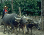
The rural market recalls numbers, symbols and colours better than printed messages. These symbols and numbers have worked magic here. This market also has a distinct preference for bright colours like red and yellow. |
 |
|
|
| Launch Of Lenovopartner.com |
 |
We have developed this first level of Business Partner Portal to facilitate and manage the partners. Its convenient and user-friendly interface allows the partners to use it for their claim processing, schemes update and stock tracking. This W3C compatible portal focuses primarily on easy navigation, speedy download, bulk data processing with strong backend having in mind usability, accessibility and scalability. This also has a tutor to help the new online users. This is just the beginning of a data driven Business Partner Portal and it will be elevated with lot more partner related facilities. |
|
| Ayngaran Gets Set To Rock The World |
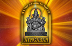 |
Ayngaran , UK needed to project a strong global brand identity with an Indian face that would convey their key differentiators quality and innovation. The company is a multi-faceted entertainment company with interests in web products, software, video/audio products besides production, exhibition and distribution of films. We had to unify all these and converge them into a standardised physical identity. To achieve this their logo was revamped and a 3D logo animation was created by incorporating the 5 elements water, earth, fire, air and sky as a prelude to the logo’s appearance. A corporate film that quickly takes viewers through their multi-faceted activities was developed for their global audience too. |
| Amity CCSQ Education Plus |
 |
Our Education Plus campaign for Amity CCSQ was well received by youngsters aspiring to fulfill their dreams. The ads focused on highlighting their course offerings like quality testing and testing training |
 |
|